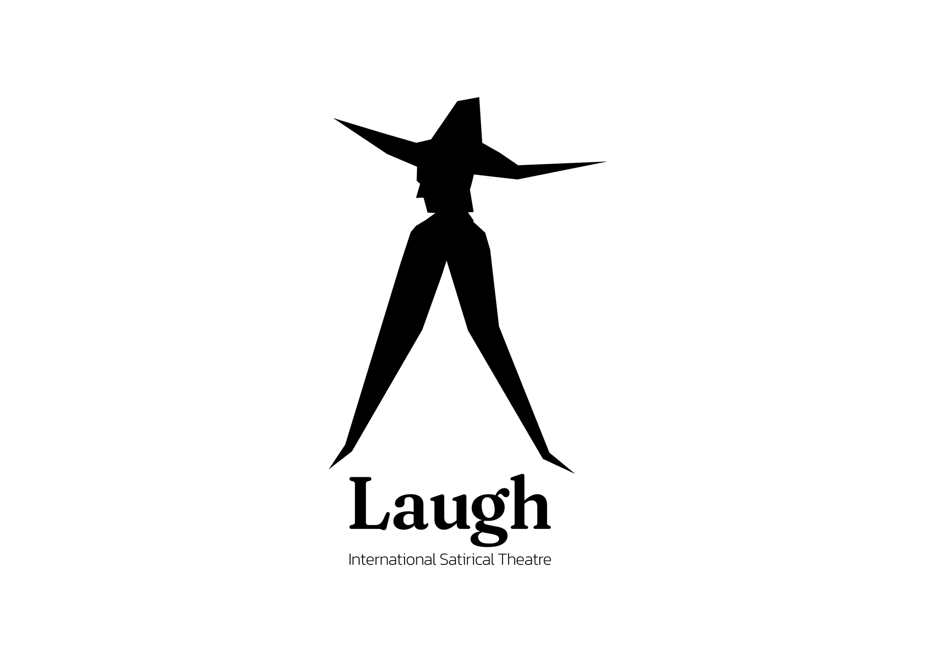
Project Title: Laugh - International Satirical Theatre
A conceptual visual identity project for Laugh, a fictional international theatre located on a small island in the Mediterranean. Laugh produces darkly satirical plays and stand-up performances, offering a humorous yet biting reflection on life in the Mediterranean and beyond.
This project explores how a theatre's visual language can communicate mood, geography, and attitude across printed matter, signage, and storytelling.
Laugh is not a real theatre, but it could be. Set on a fictional island in the Mediterranean called Pangos, it hosts satirical plays, visiting acts from abroad, and stand-up performances with a slightly gothic twist.
The theatre’s content blends local absurdity with international irony, by tackling topics like climate anxiety, bureaucracy, overtourism, religion, and Balkan corruption, all of them through a darkly comedic lens.
This case study presents the theatre’s visual identity system, with applications including:
A sample poster for a fictional in-house play
Exterior signage
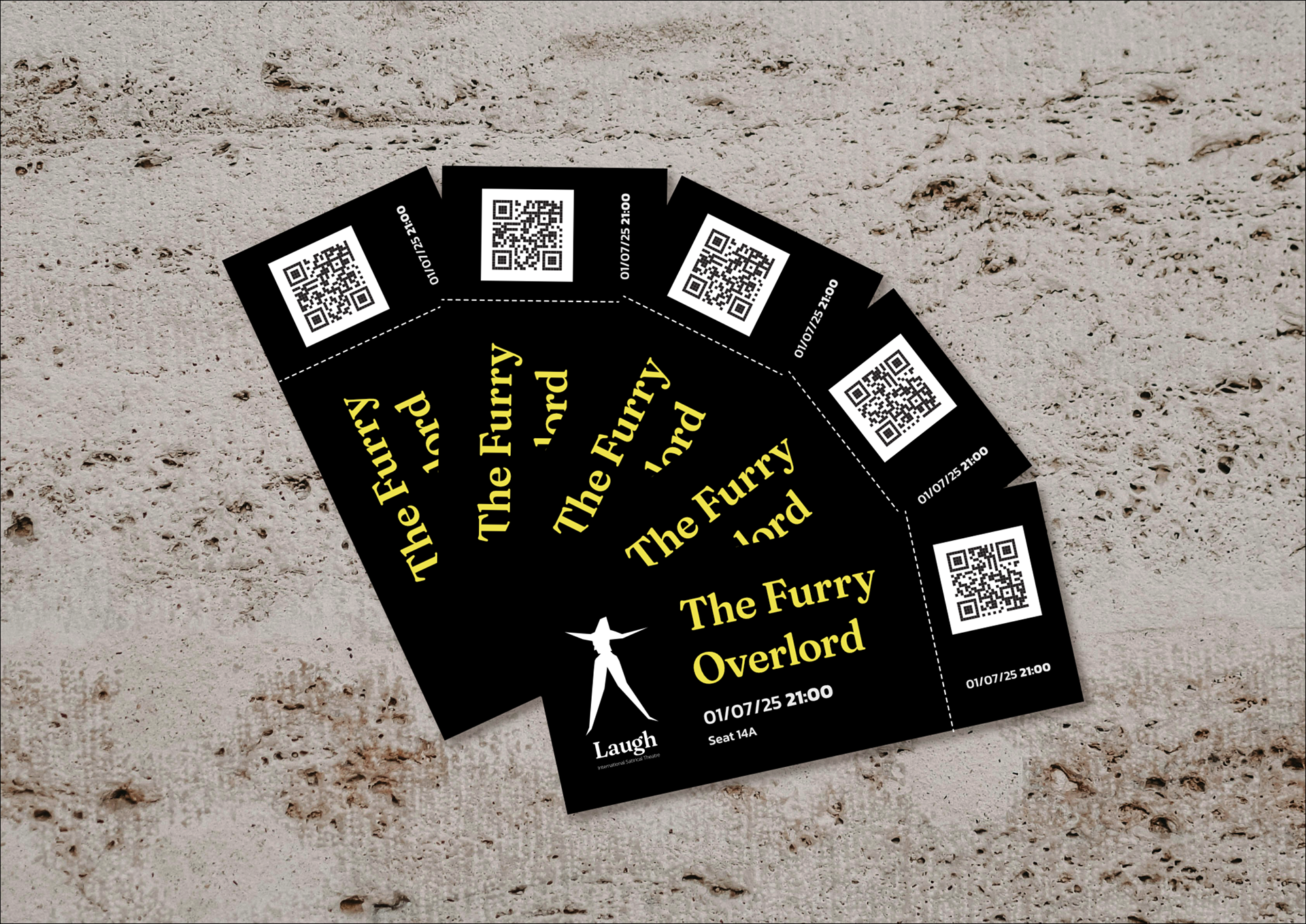
Tickets
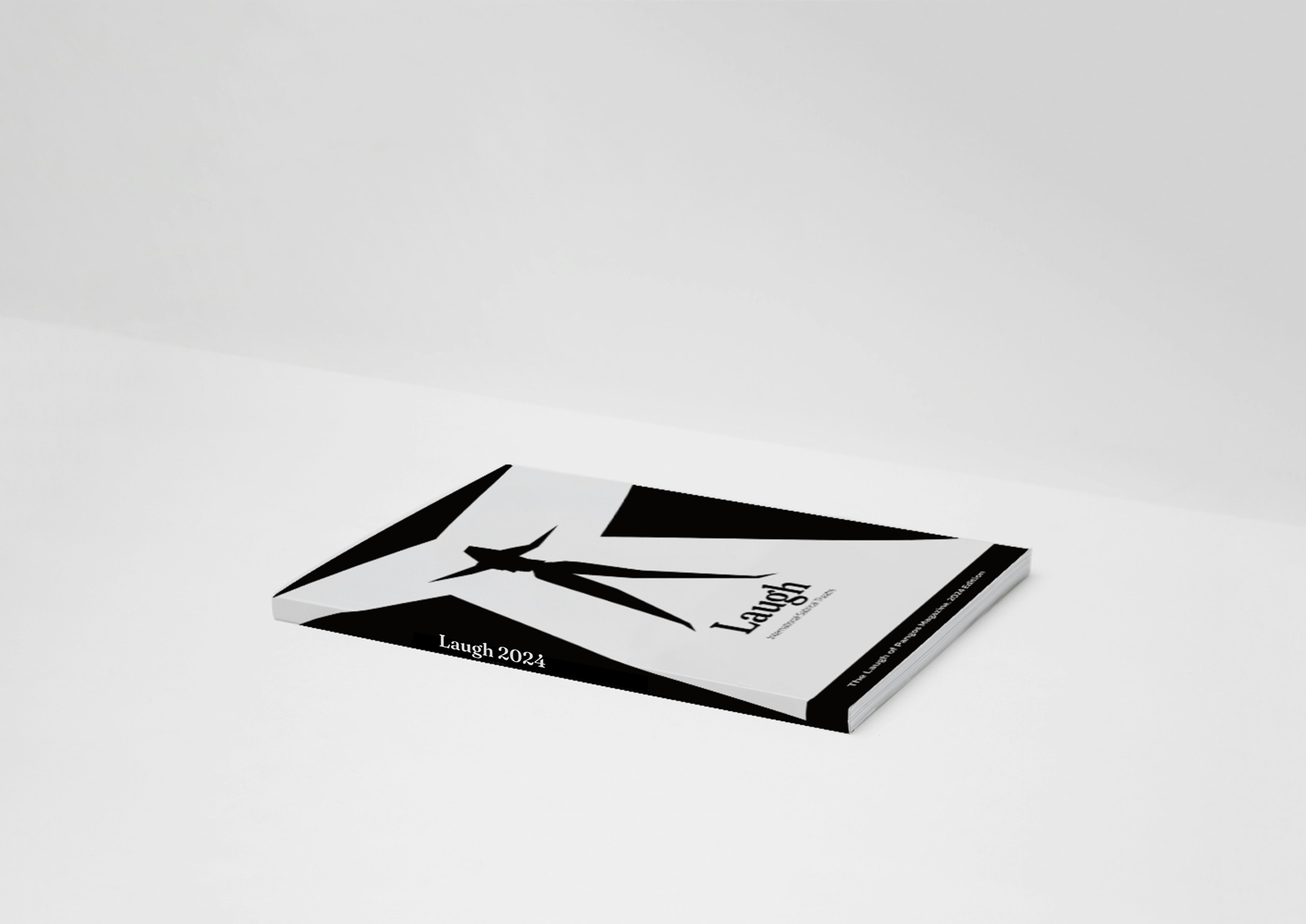
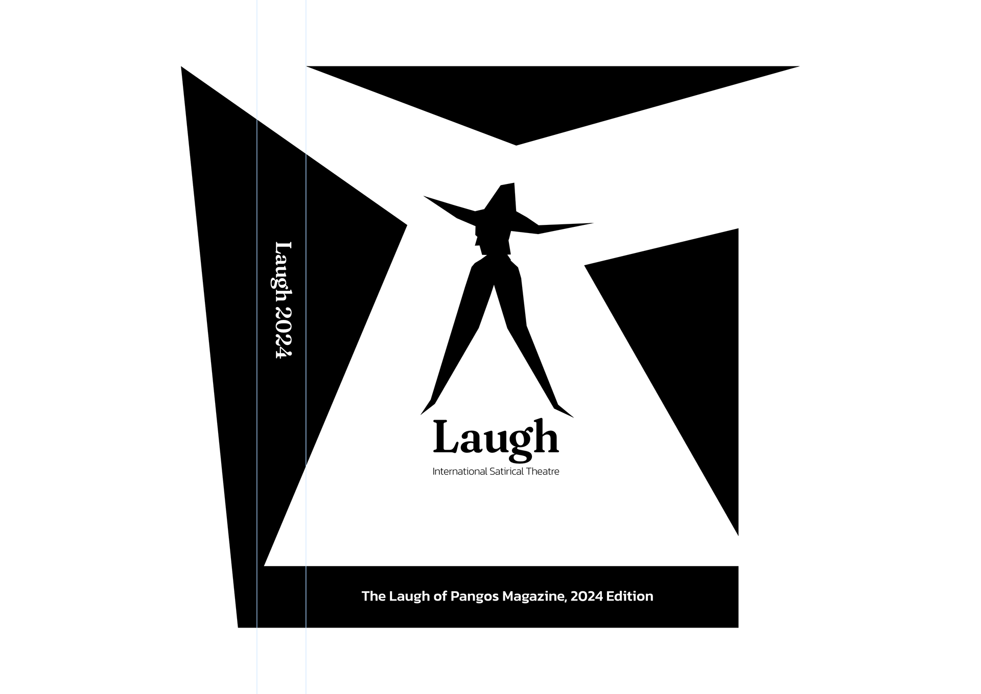
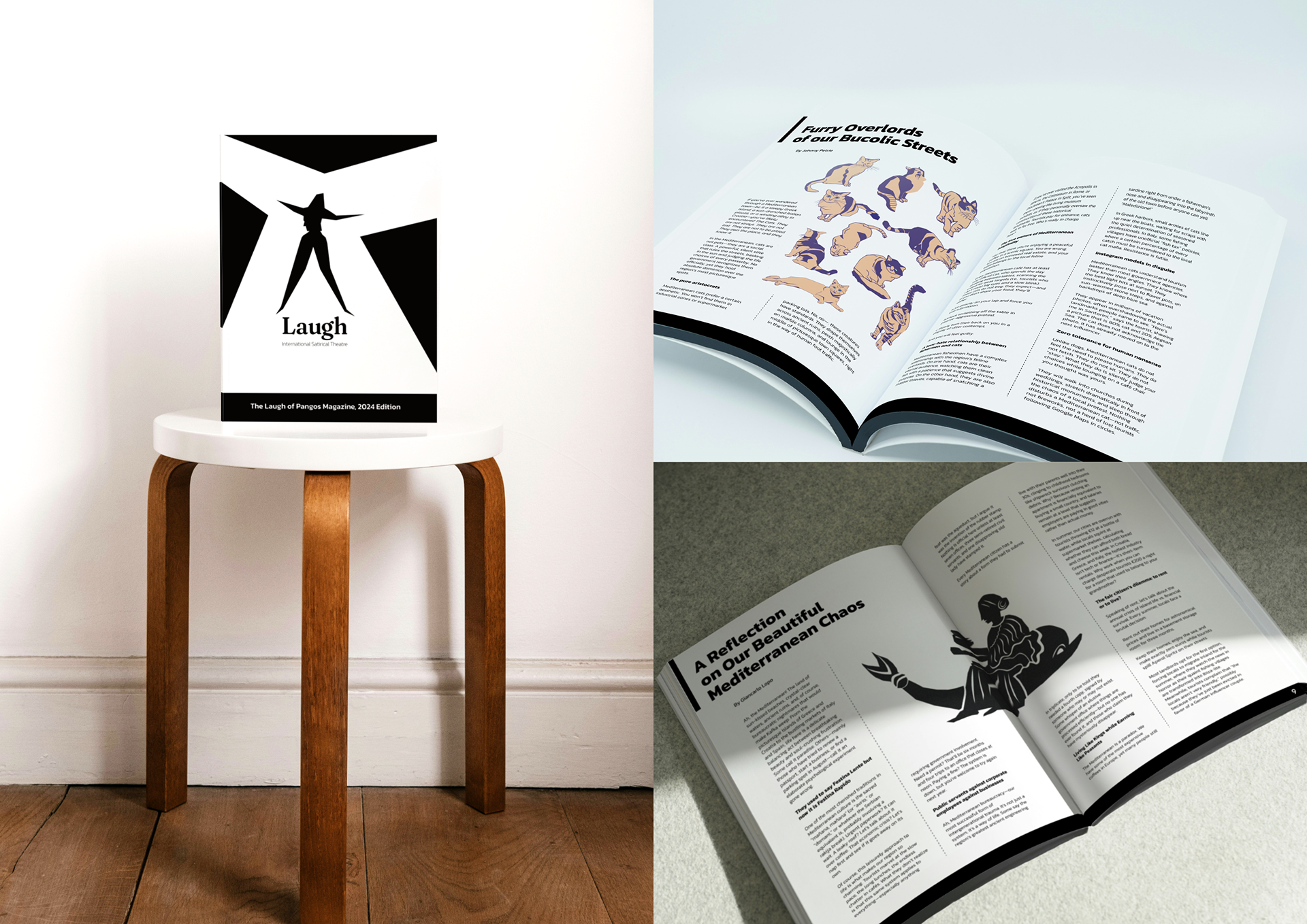
The yearly printed magazine
Tickets
The yearly printed magazine
The name Laugh is chosen as a direct and honest description of the theater.
It is a simple place on a simple island, intended to come for a light hearted content and some laugh.
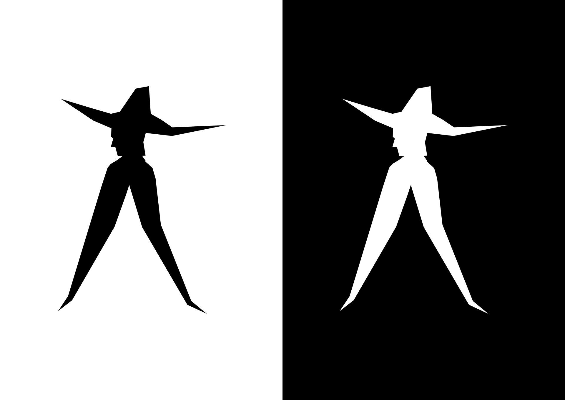
The strategy was not about creating a literal laugh themed visual. Instead, I opted for a motif with a twist, to illustrate the theatre’s funky character and catch the viewer’s eye with its ambiguity. Whether it provoked a laugh itself or not is up to a viewer: some people laugh more easily than the others.
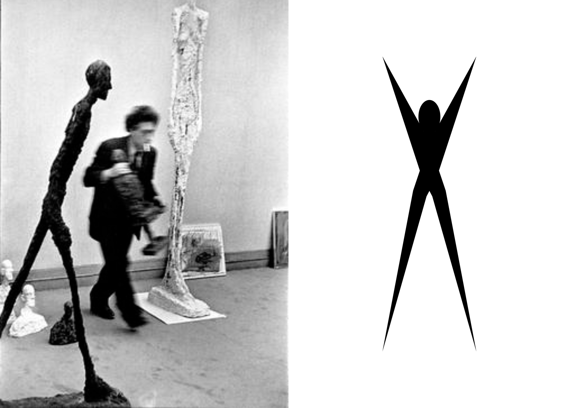
The main illustration is based on the aesthetics of the works of the Swiss sculptor Alberto Giacometti. His sculpture work hold a unique “poetry in motion”, which for me personally resembles a figure in a satiric theatre.
My initial vector figure is as stretched, but has the hands up. Subsequently, I manipulated the vector graphic, giving it its final shape.
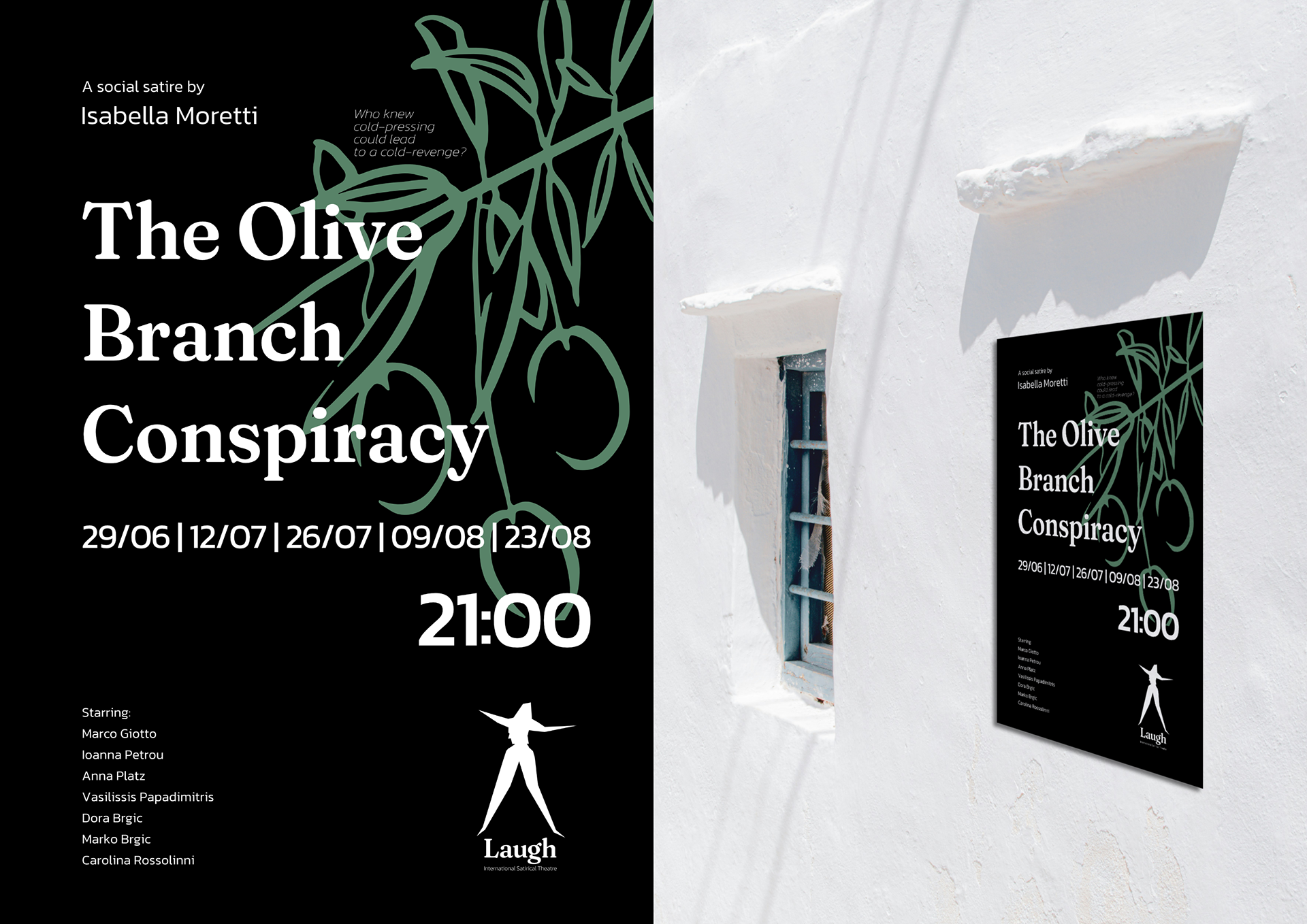
Poster Design: The Olive Branch Conspiracy
This play was developed to show how the identity might support fictional internal productions.
The Olive Branch Conspiracy is a satirical drama about feuding olive oil dynasties, equal parts Greek tragedy and small-town gossip.
Design notes:
The black background hints at the theatre’s darker tone
The olive branch illustration serves as a visual anchor to the main topic
Typography is stark, but the layout leaves room for irony
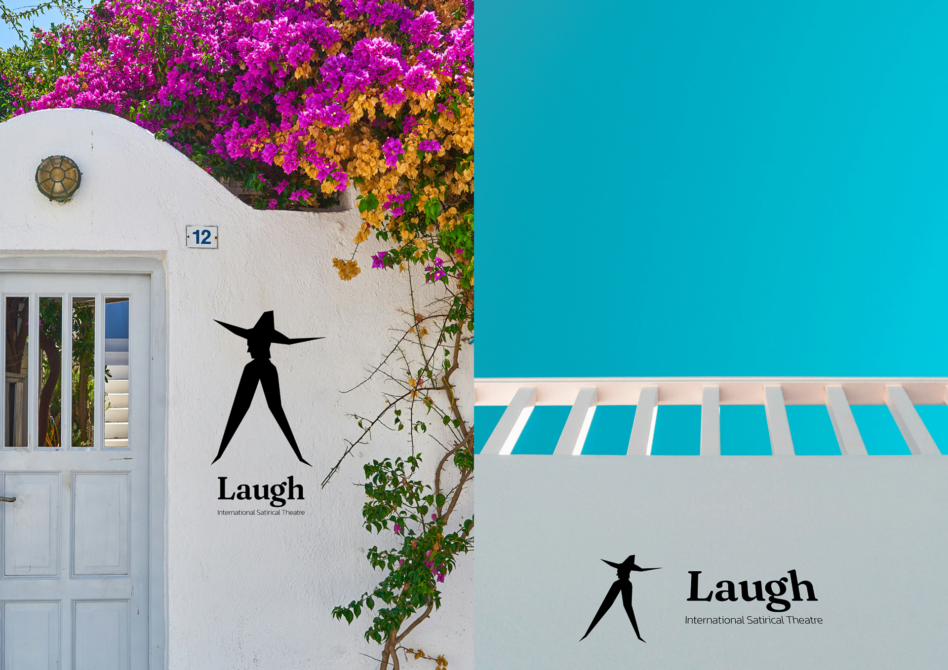
Exterior Signage Mockups
Physical Context: The Island & The Street
The theatre’s visual language extends to the physical space, signage, and posters designed to blend into Mediterranean architecture while still standing out.
Here, the logo is treated with minimal contrast and a sense of permanence, as if etched into a building or hanging above a stone courtyard.
Tickets, with the theater’s logo looking like a bright light.
Printed Editorial: The Laugh of Pangos Magazine
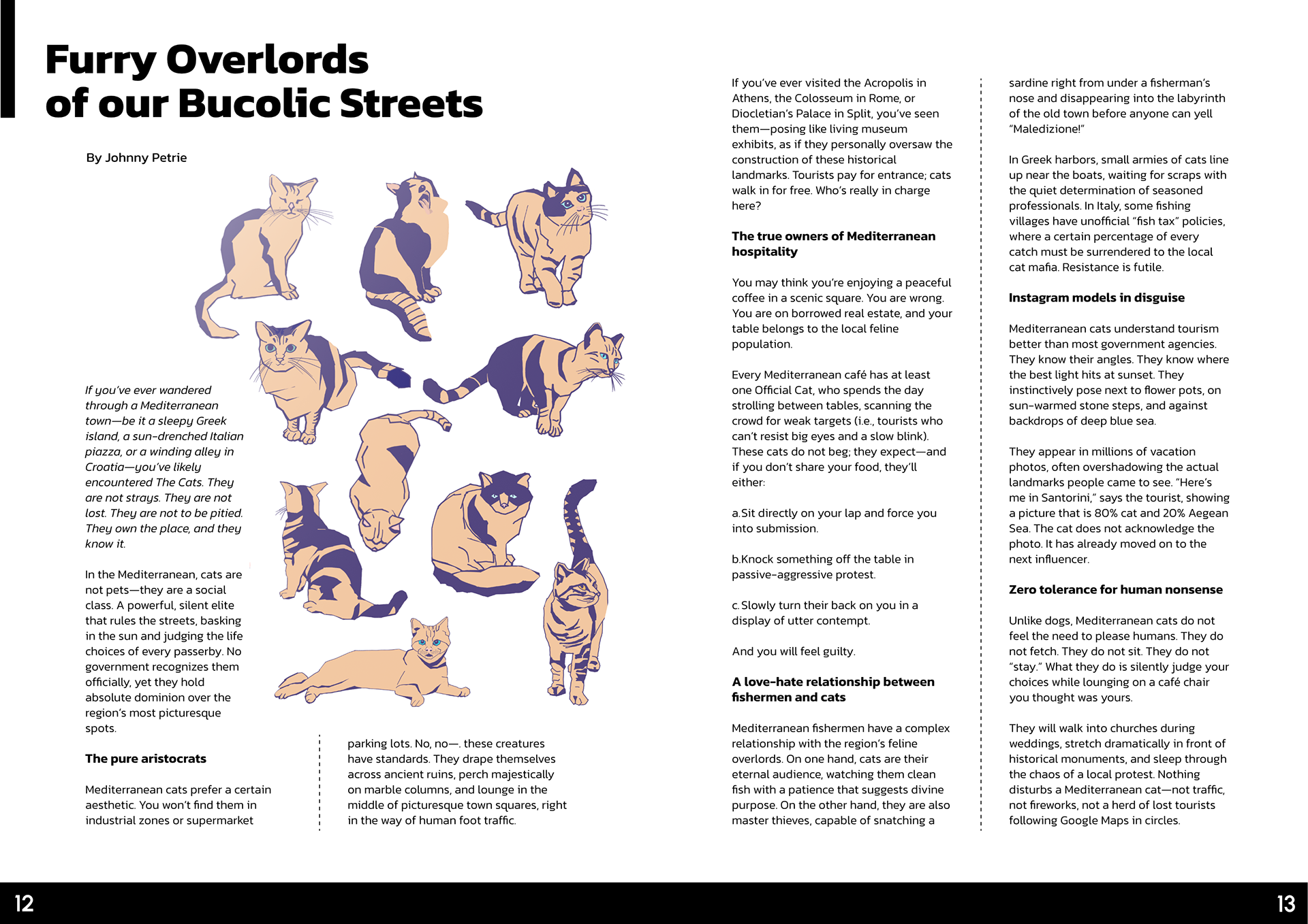
The yearly theatre magazine collects satire, commentary, and humour from around the large cultural continuum of Southern and South East Europe. It features:
- Editorials
- Satirical essays on Mediterranean life
- Interviews with fictional (and real) creators
- Visual comedy spreads
The editorial tone is playful but thoughtful, inviting readers into the fictional world of Laugh, while echoing real social absurdities across the Mediterranean and the Balkans.
Thank you for your attention!