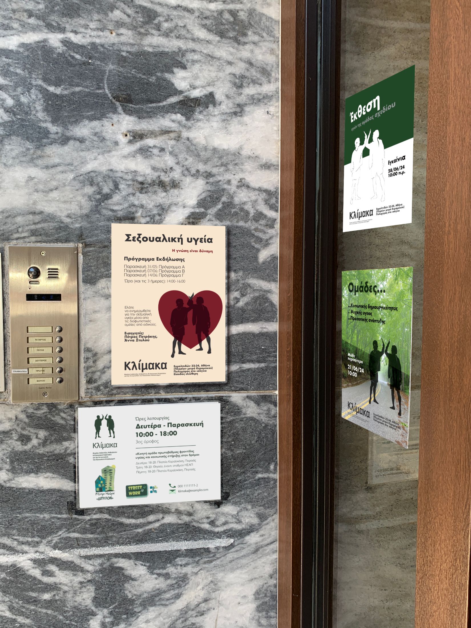
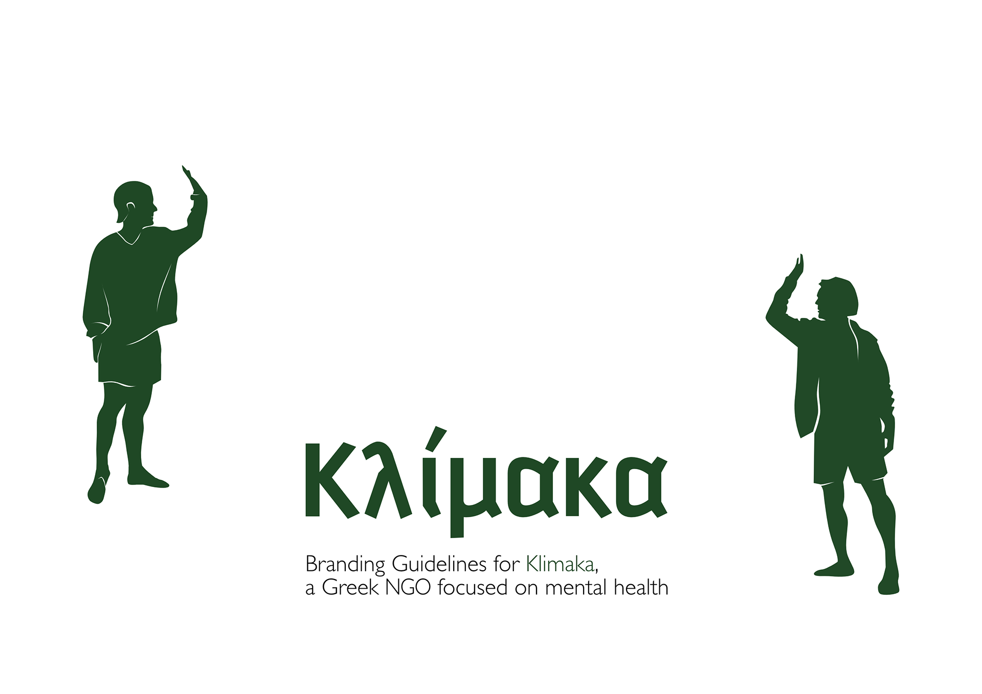
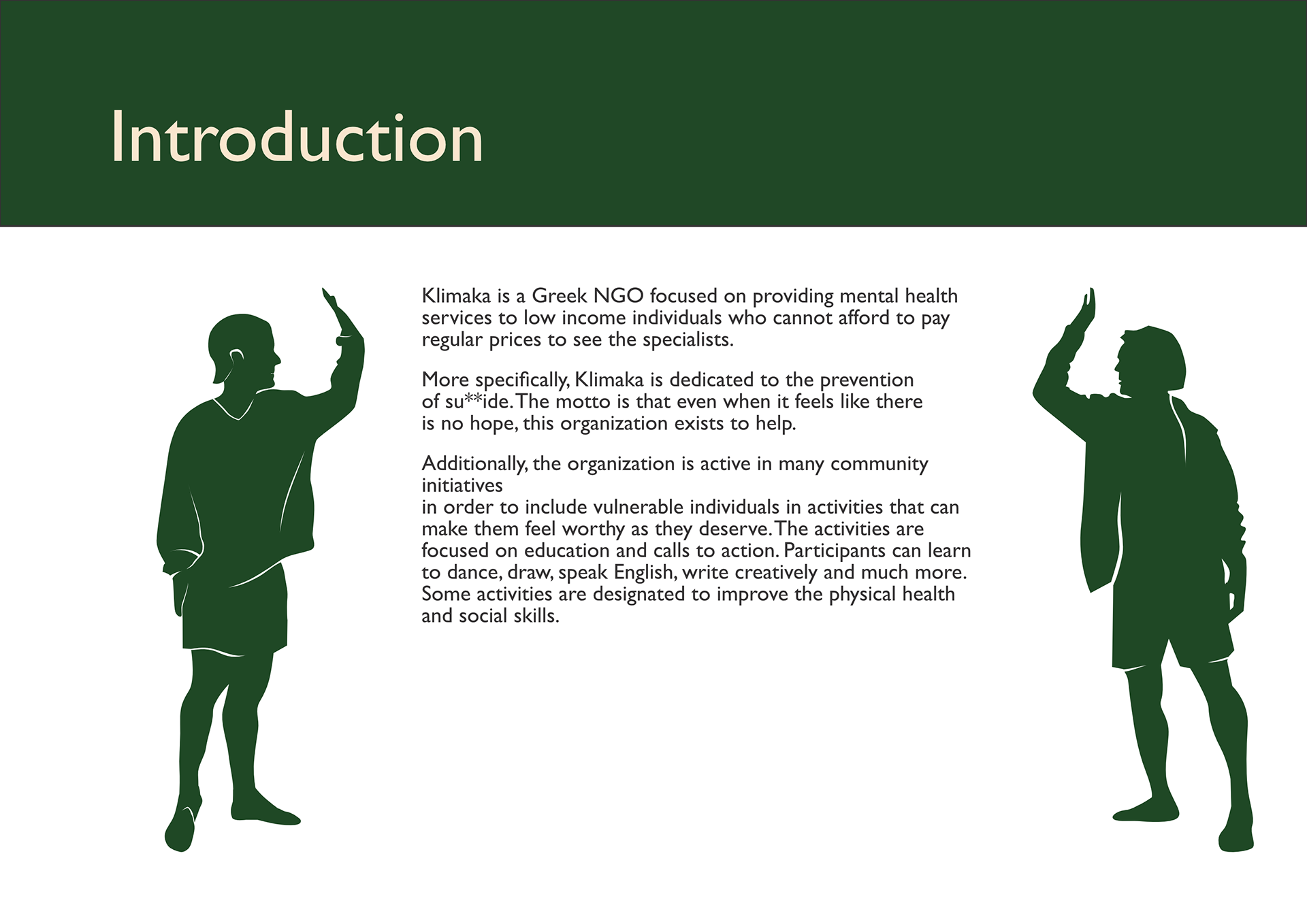
This visual identity project is local to Greece. It is made for an NGO dedicated to mental health and it is heavily based on illustrations and clear communication towards the people who need to be informed.
Working with Greek letters proved challenging for a variety of reasons. In order to find the right balance in typography I needed to break some rules and use 3 font families, so I limited one of them to the logotype only, to avoid too much noise.
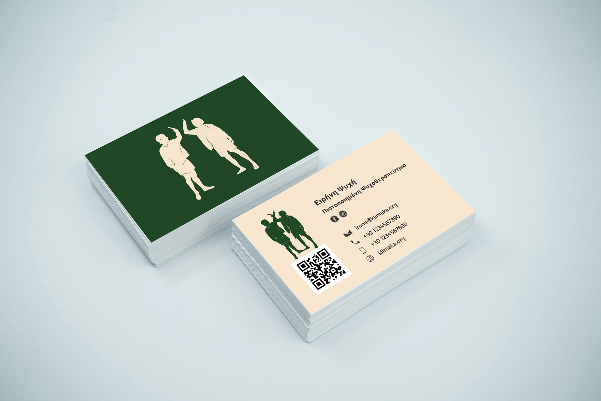
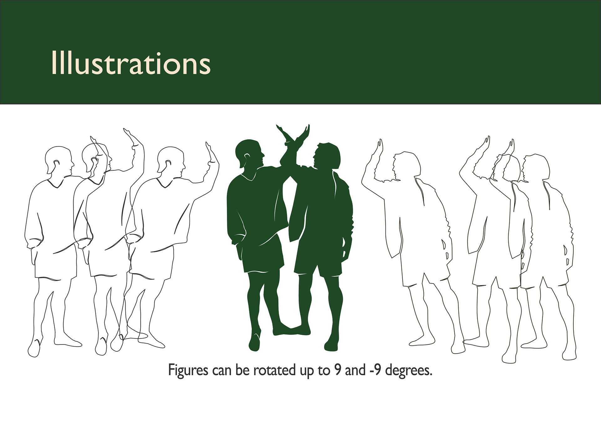
Just like a few of my other illustrative design projects, I made illustrations highly flexible so that they can be applied to a variety materials, while still keeping a unique character.
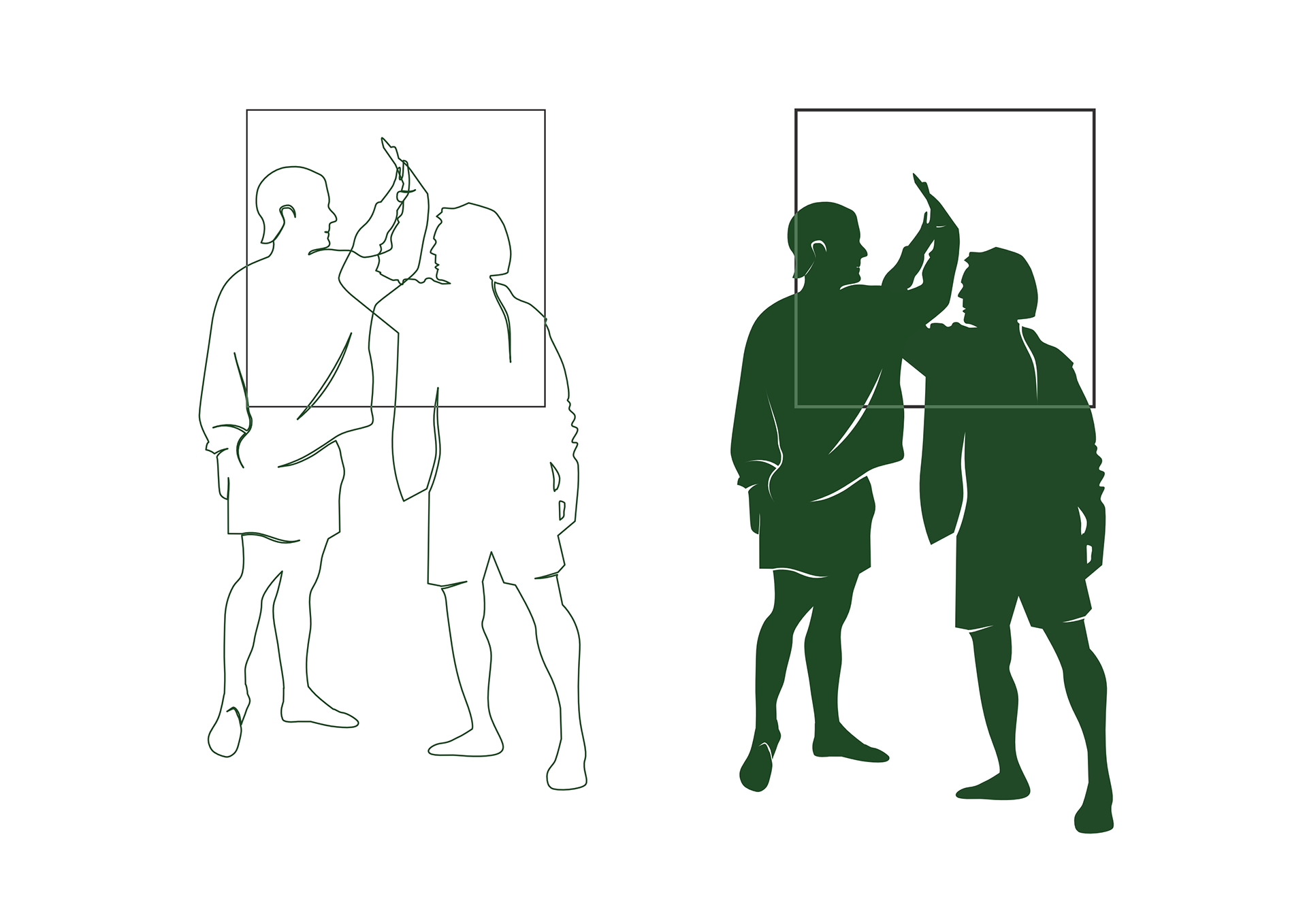
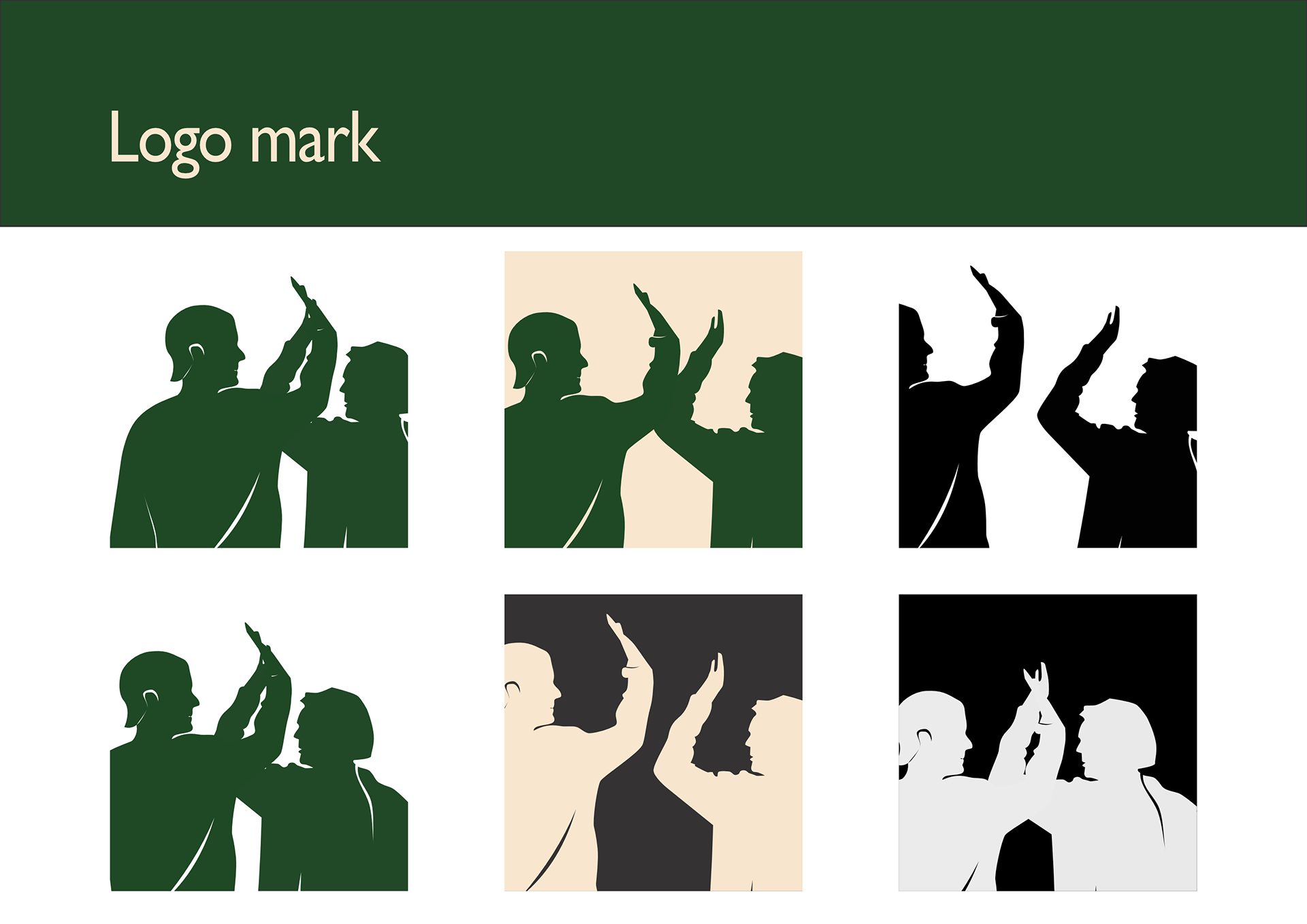
Logo marks allow small differences in alignment of figures within the frame but they are always limited to a square shape they are nested in.
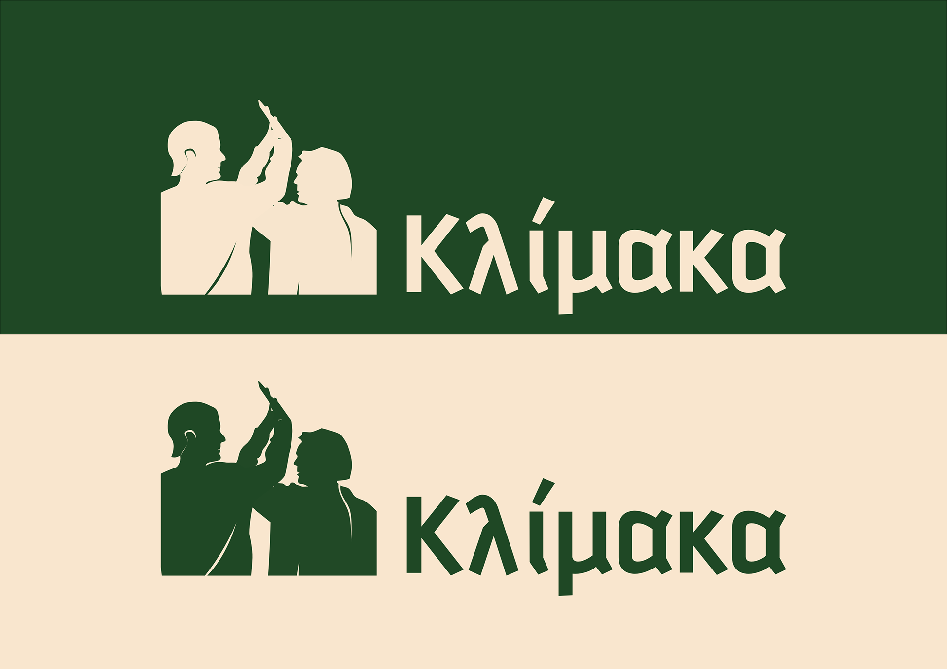

The grid defines the needed safe space between the logo and the rest of the elements. The logo type and mark may be laid out together or independently.


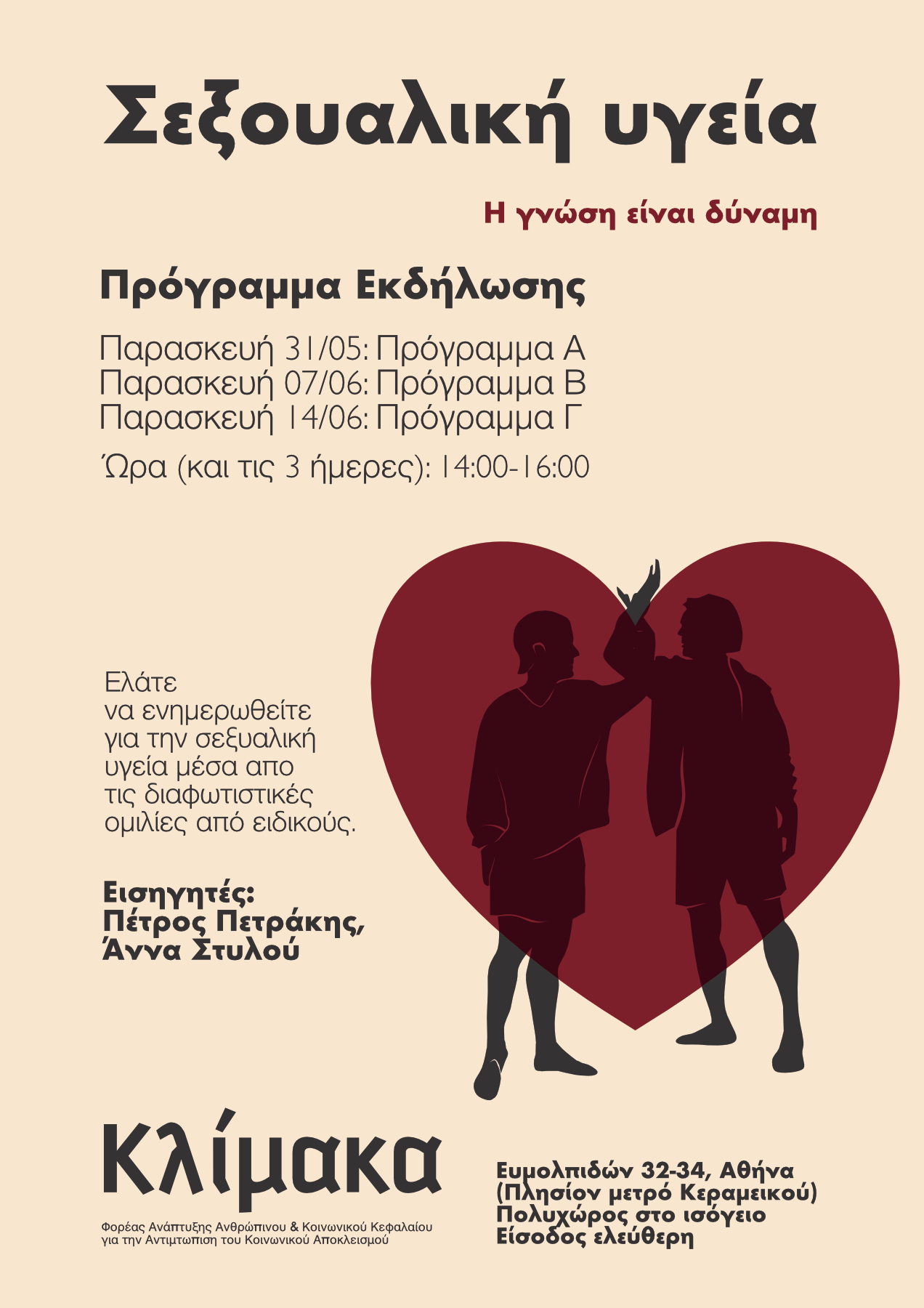
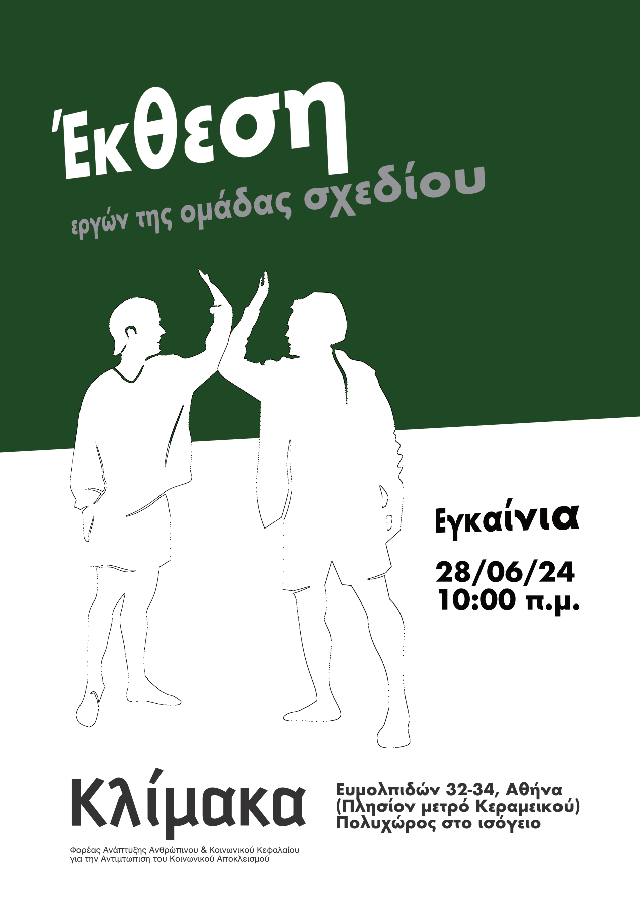
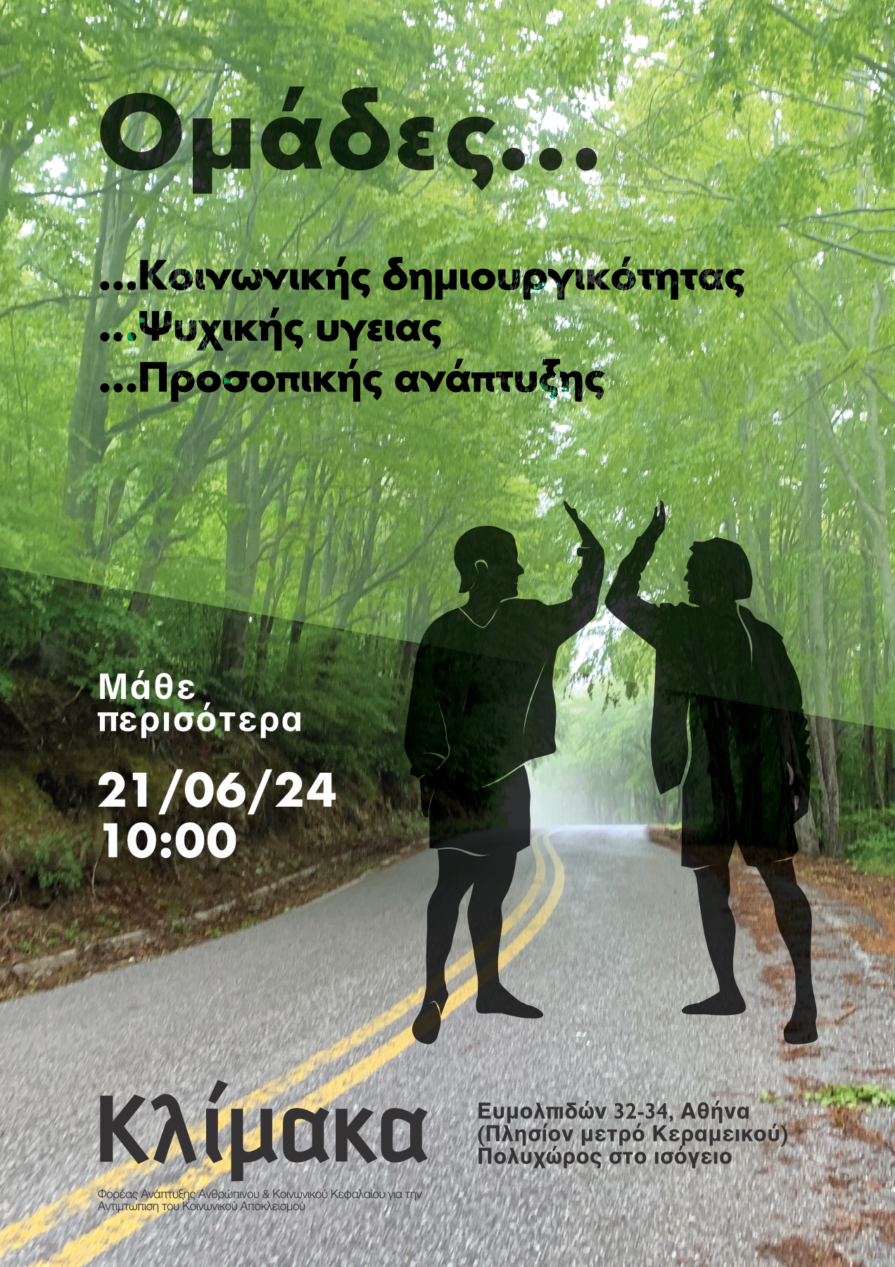
Posters and booklets are an important part of the organization’s communication towards the vulnerable groups. A few proposals I did have the goal to use a creative approach to graphic design without sacrificing too much of the accessibility. In other words, the visual hierarchy allows viewers to understand the most important part first.